National Film Festival for
Talented Youth 2020 Rebrand
National Film Festival for Talented Youth (NFFTY) is the world’s largest film festival for emerging directors. Each year the festival showcases films by directors 24 and under. NFFTY supports young filmmakers by offering professional level workshops year-round. In addition NFFTY.org hosts filmmaker resources, tips, news and information.

TOOLSNotion
Procreate
Illustrator
Photoshop
After Effects
ROLEUser Research
Concept Development
Brand Development
Copy Writing
Content Strategy
TEAM—
TIMELINE6 weeks
01
The Task
A thriving and equitable film industry that uplifts youth.
The NFFTY narrative is one of progressivism. The backbone of NFFTY’s program structure and belief system is equity. This is a key part of NFFTY’s narrative. We fight against systems of oppression, and strive for inclusivity by creating equitable access to our programs. In order to be equitable we have to recognize where there is inequity. That’s why NFFTY works to elevate work by women, BIPOC and LGBTQIA+, giving them a platform to share their unique perspectives.
Context
NTTFY's MISSIONEach year, NFFTY has a festival design, however outside of festival design they were lacking cohesion in their brand identity. NFFTY desired a brand that was strong enough to carry the organization throughout the year in all advertising and marketing materials, but also something that can serve as a background for the yearly festival themes and while keeping the primary brand visible and recognizable.
02
Design System
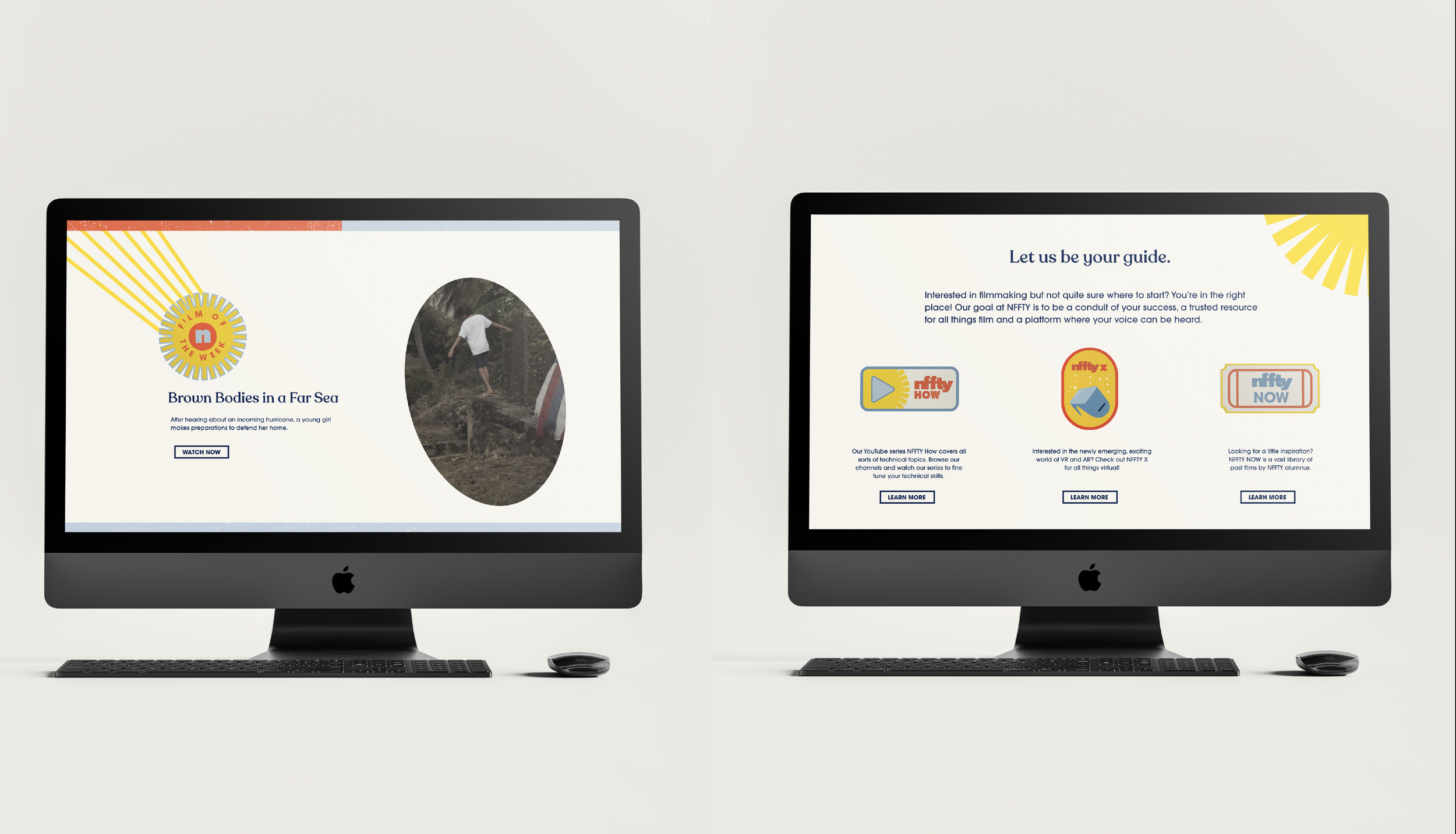
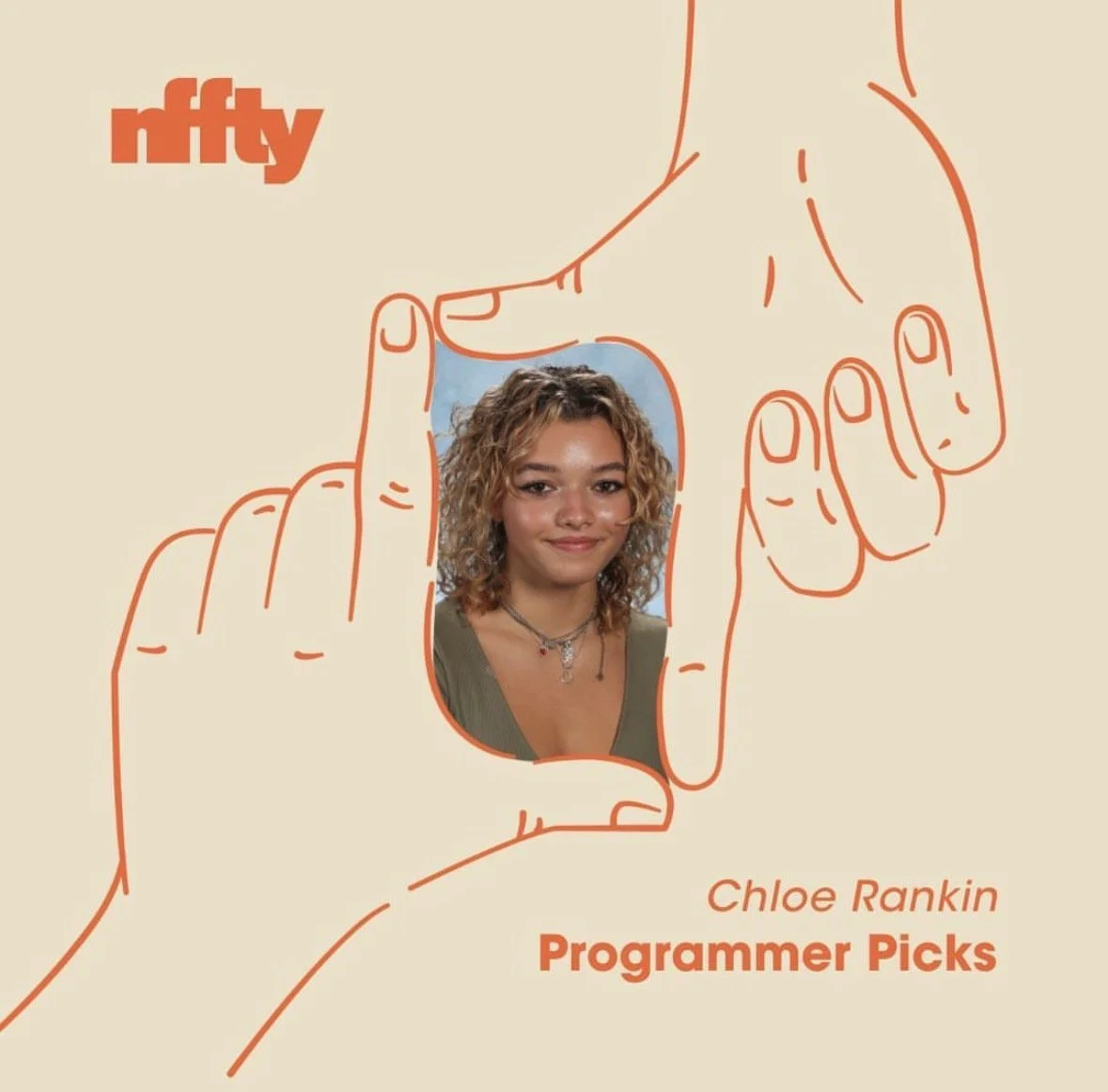
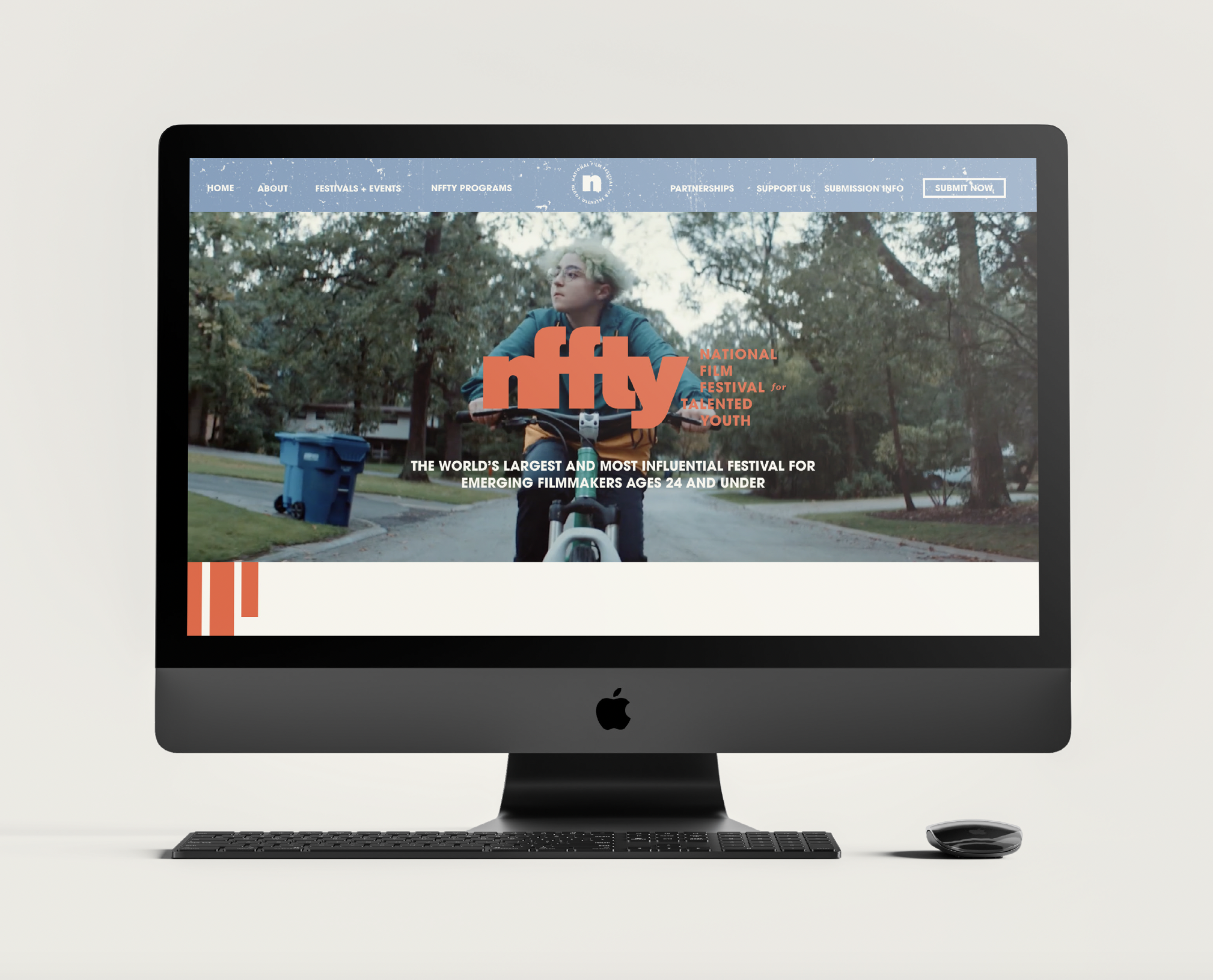
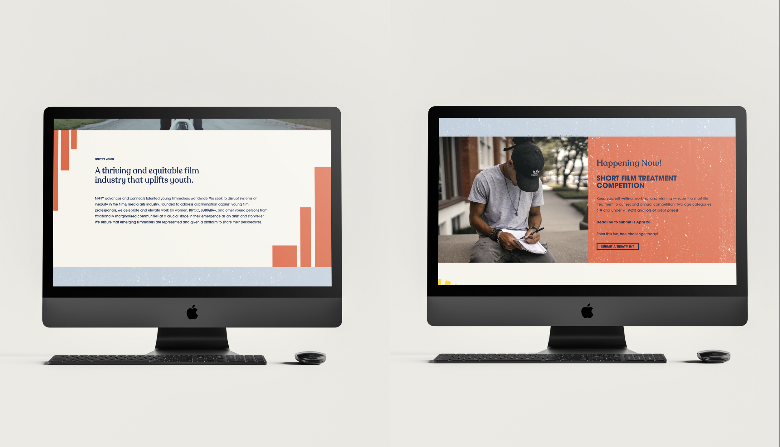
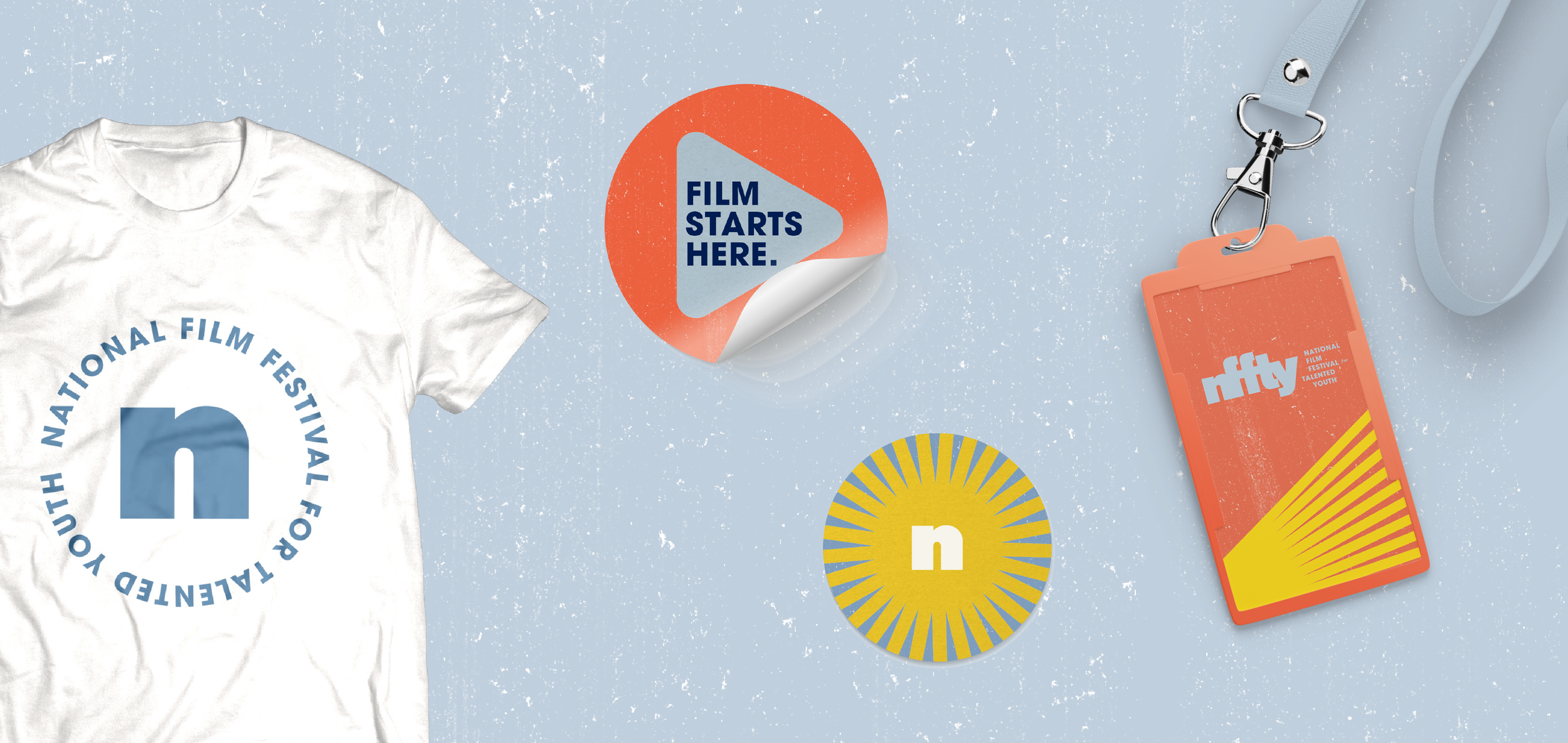
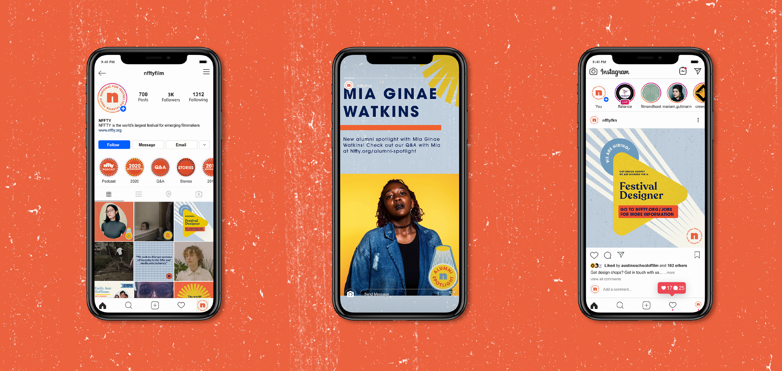
NFFTY branding was applied across a variety of platforms including web, digital assets, social media templates, merch, and motion assets.
NFFTY’s full brand guidelines can be found here︎.
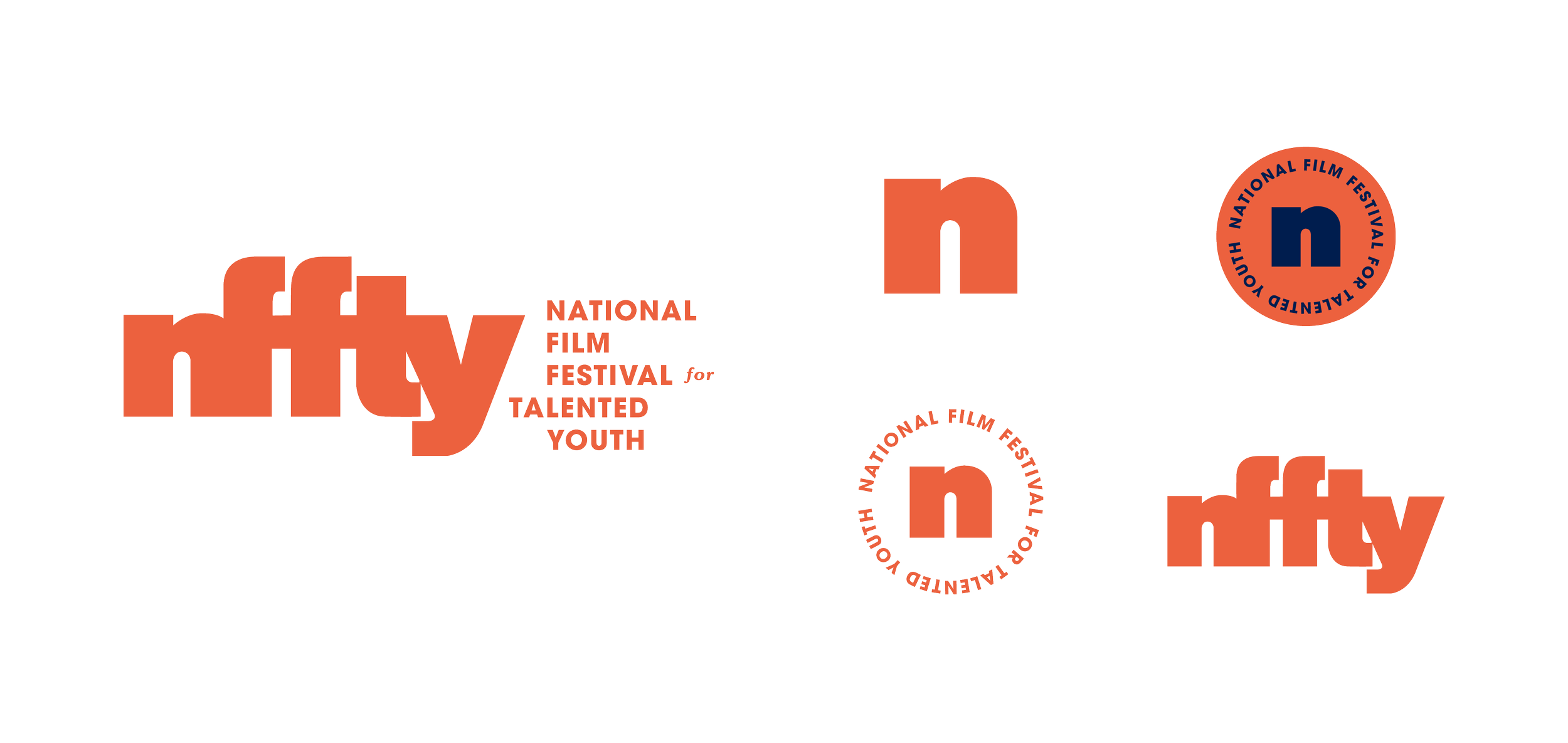
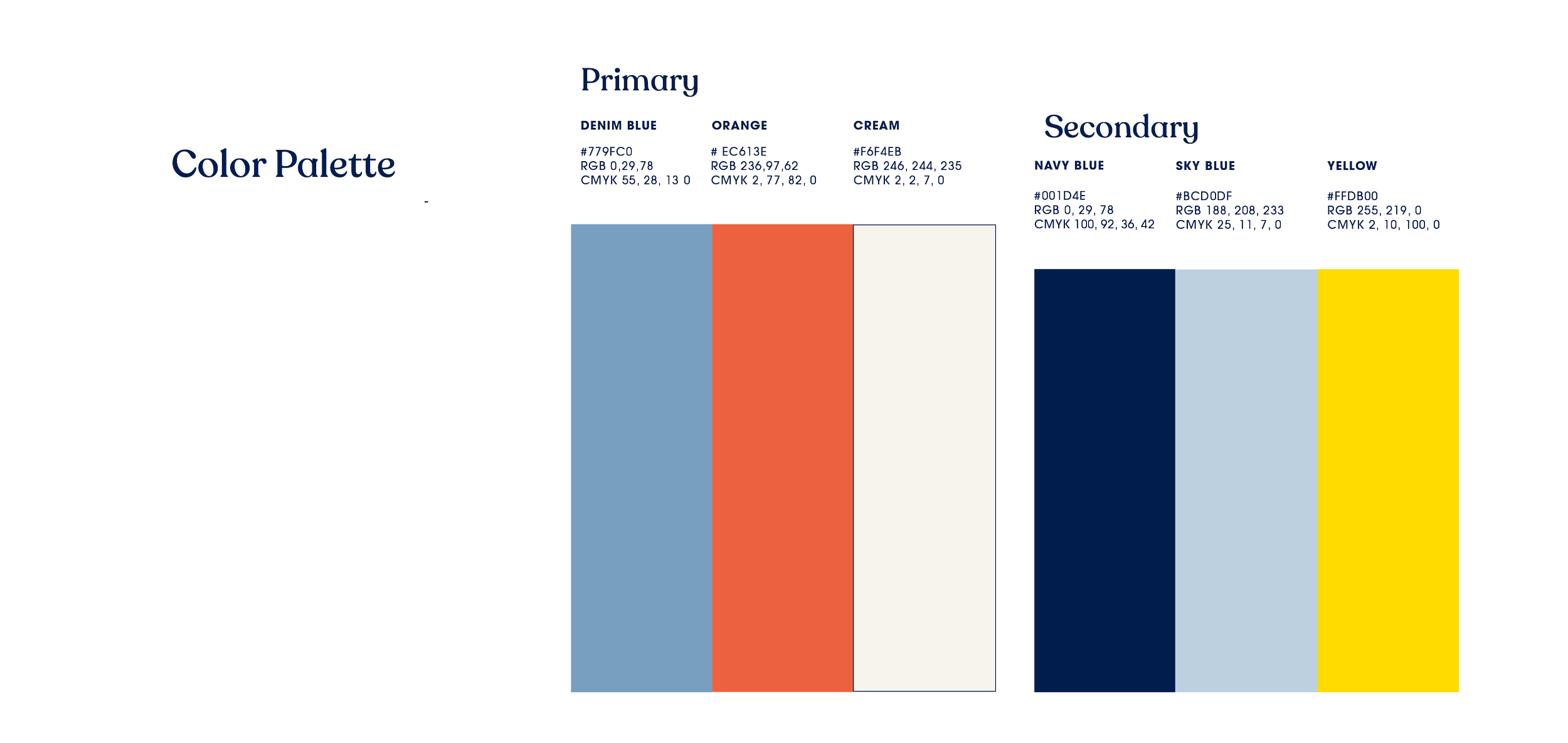
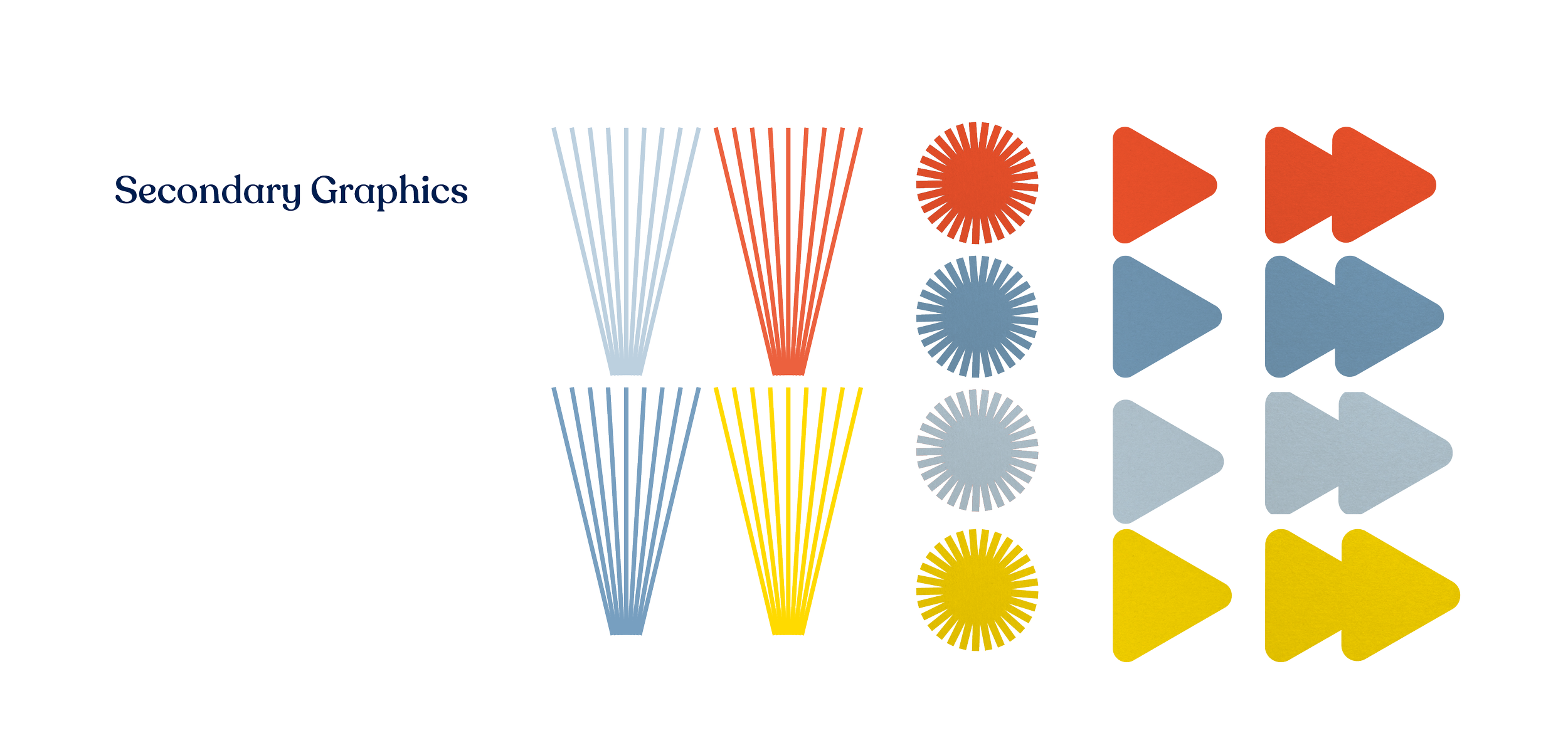
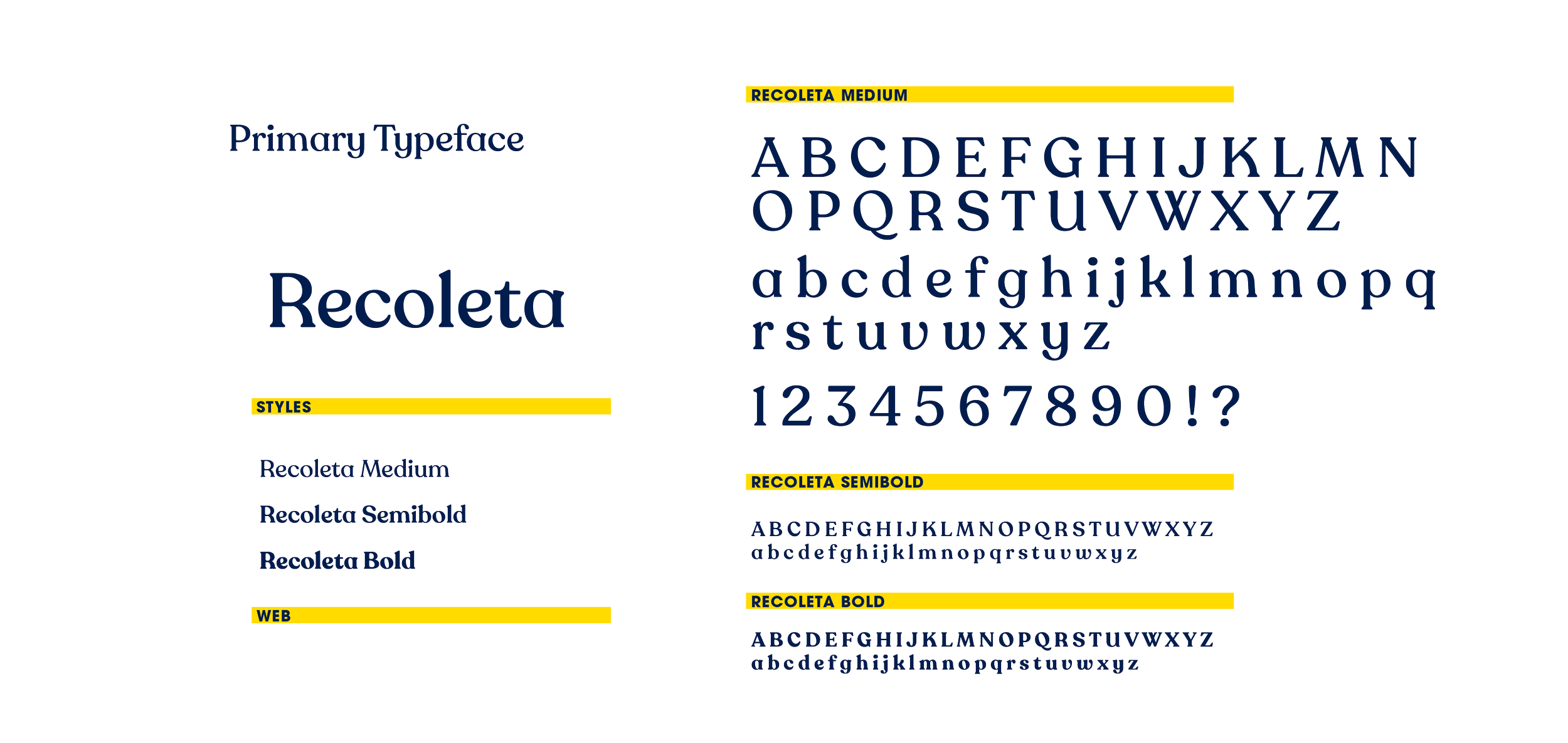
This design system includes a refresh of the NFFTY logo, as well as establishing an evergreen color palette, primary and secondary typefaces, and secondary graphics and motion graphics to be used across all NFFTY collateral. A suite of textures reminiscent of old film was incorporated with the goal being to keep graphic elements simplistic in nature so that any overlapping yearly festival design could incorporate the shapes or textures as well as have freedom to develop a unique expression without clashing with the evergreen brand.
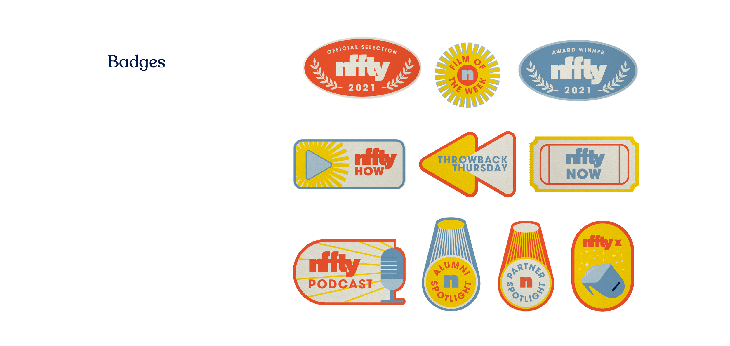
The palette incorporates a combination of vibrant and cool tones and overall leans into the brand attribute of boldness. Distinct amongst the brand identity is the series of badges, designed to identify secondary programs within the overarching NFFTY brand.
In whole the NFFTY Team was provided an in-depth brand guidelines, as well as a full brand package of useable parts for their internal visual comms team.

03
Use Cases
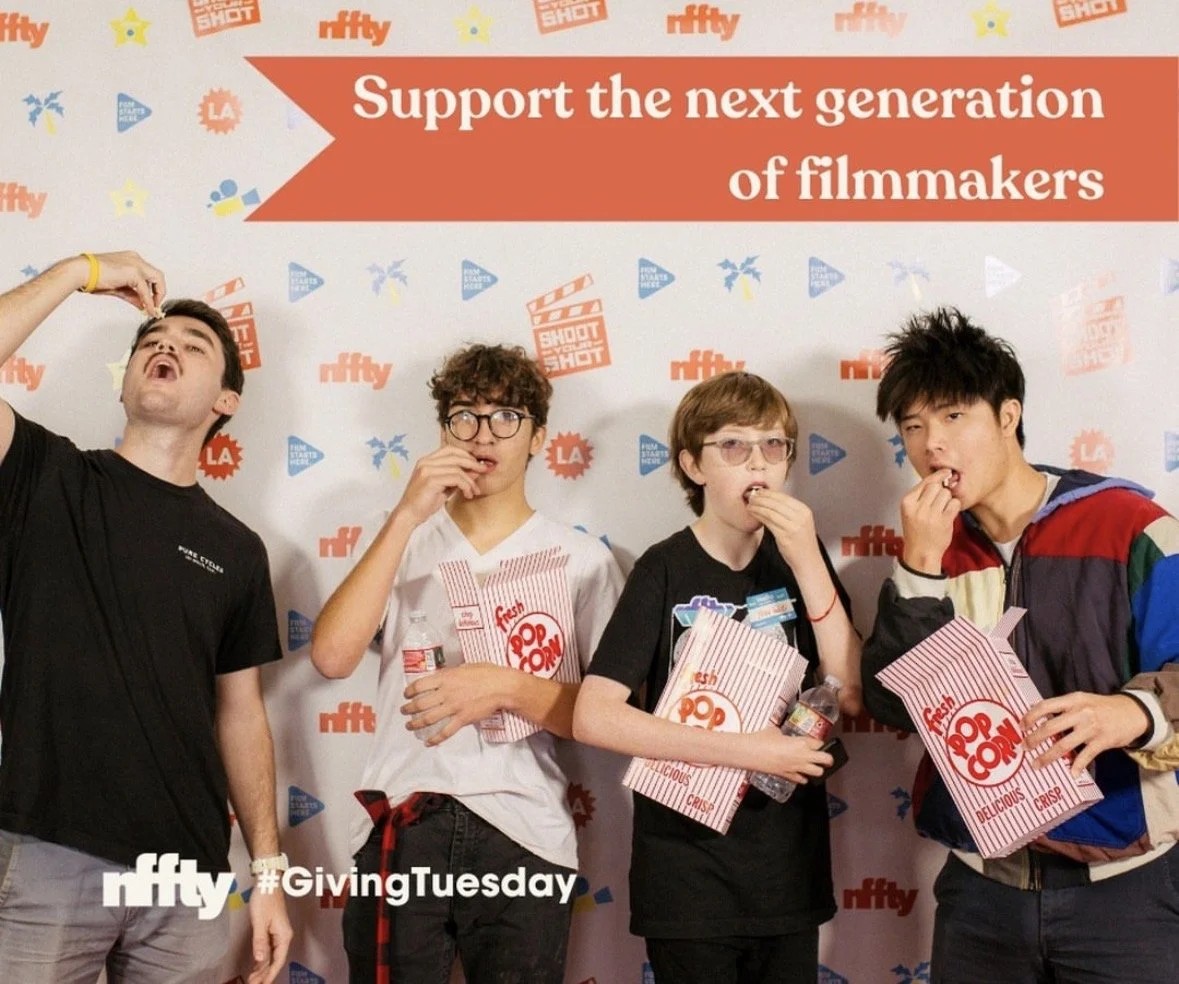
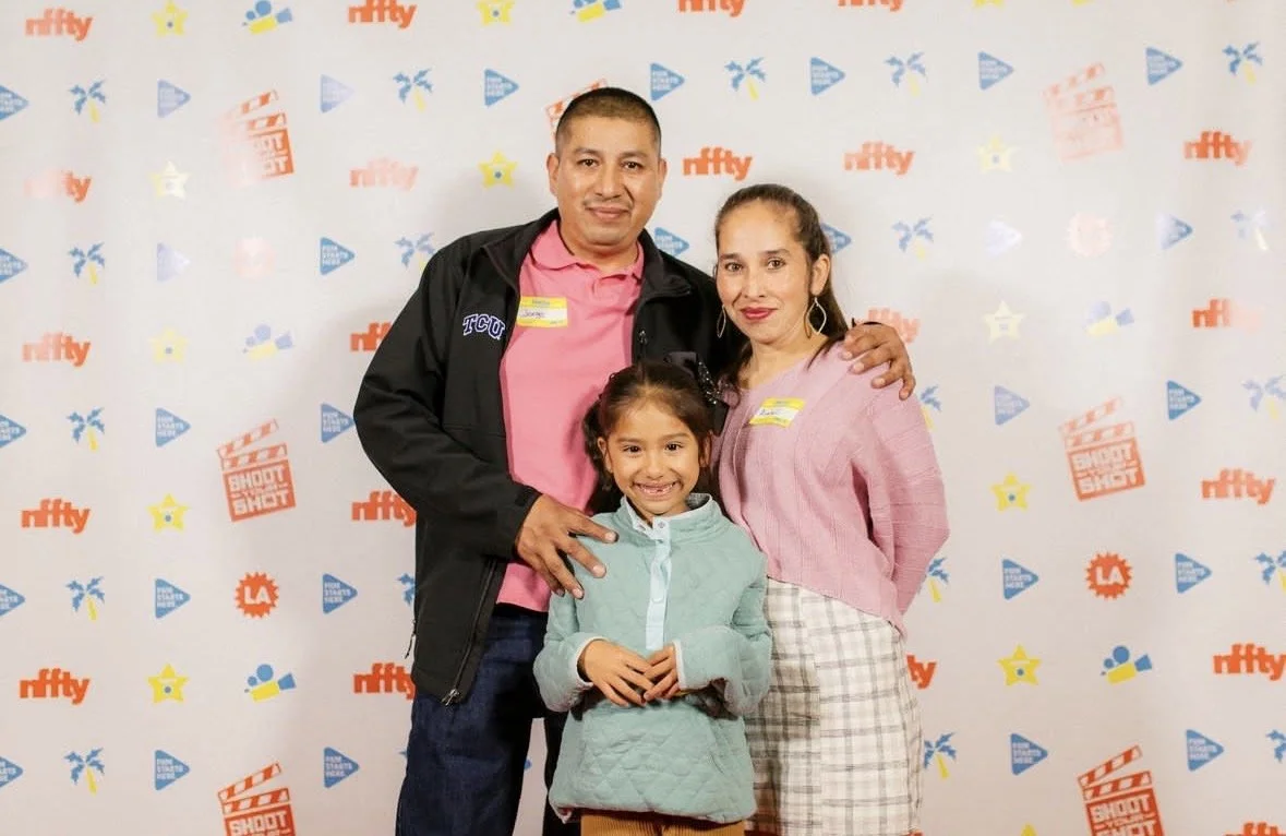
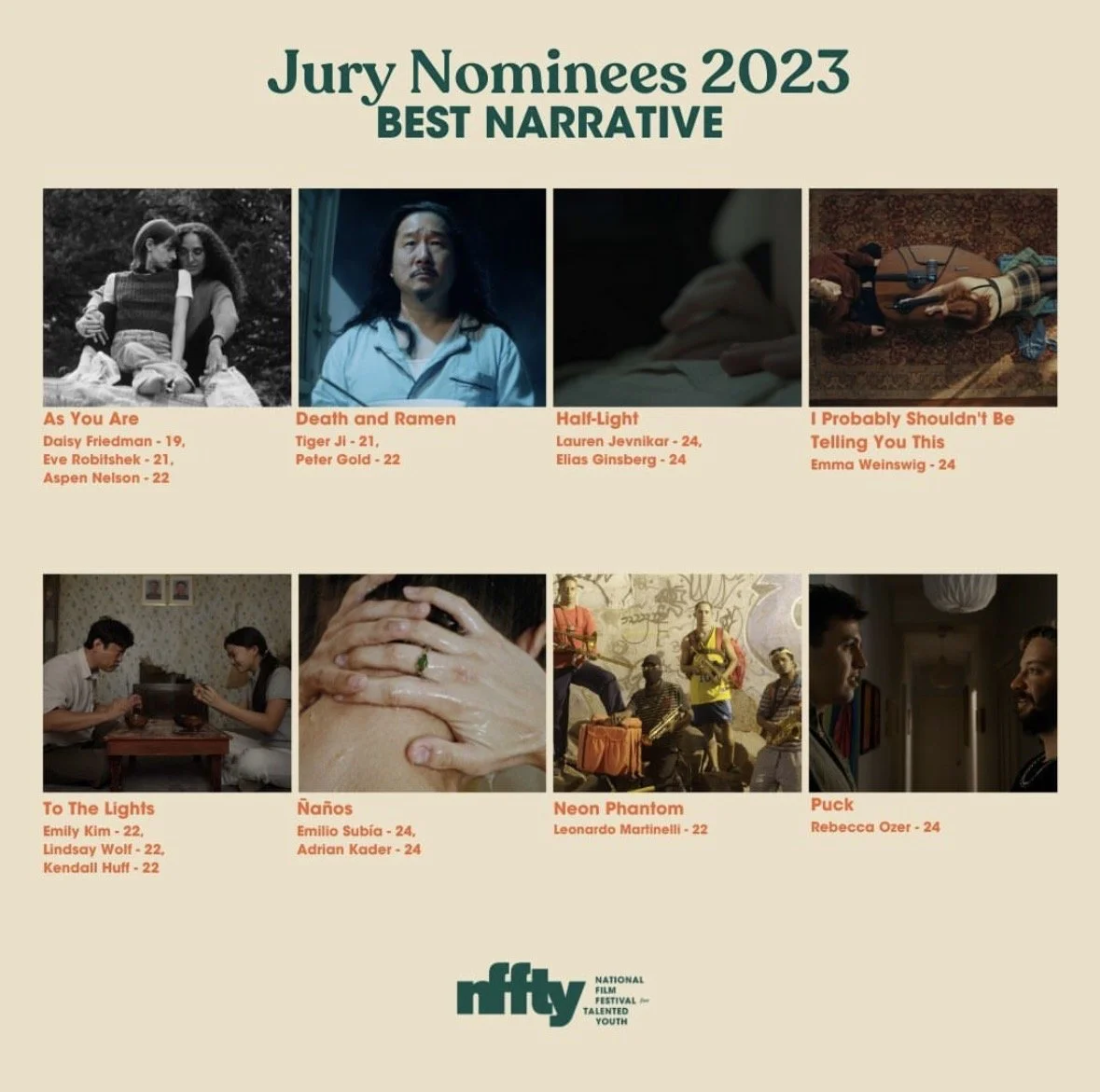
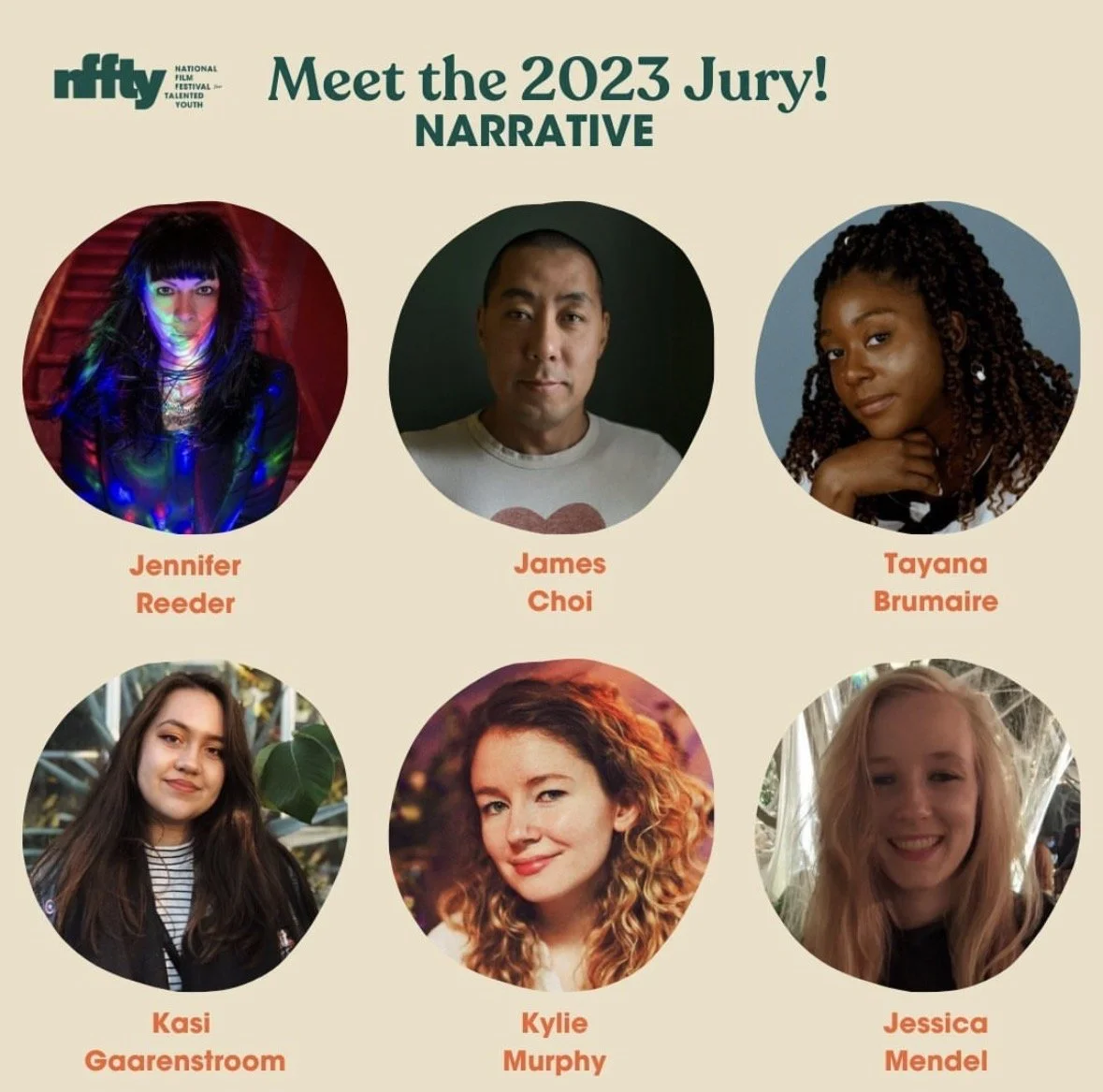
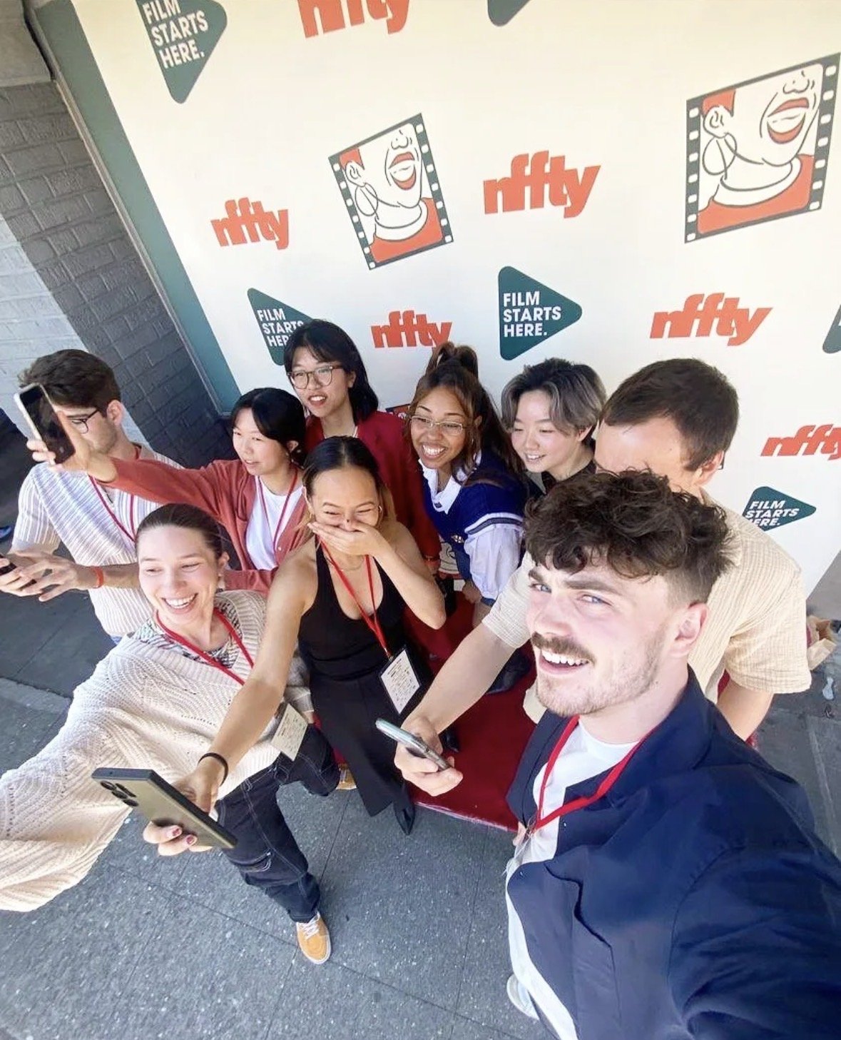
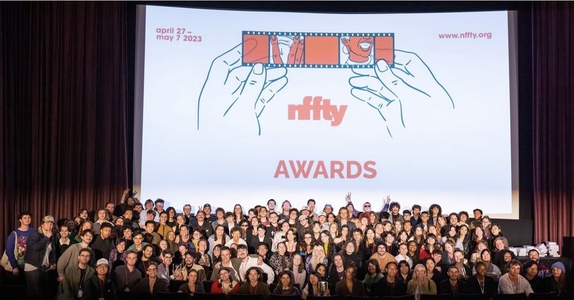
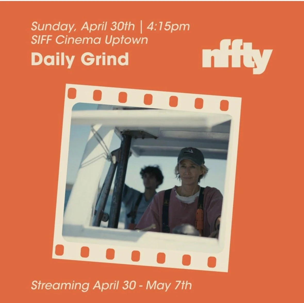
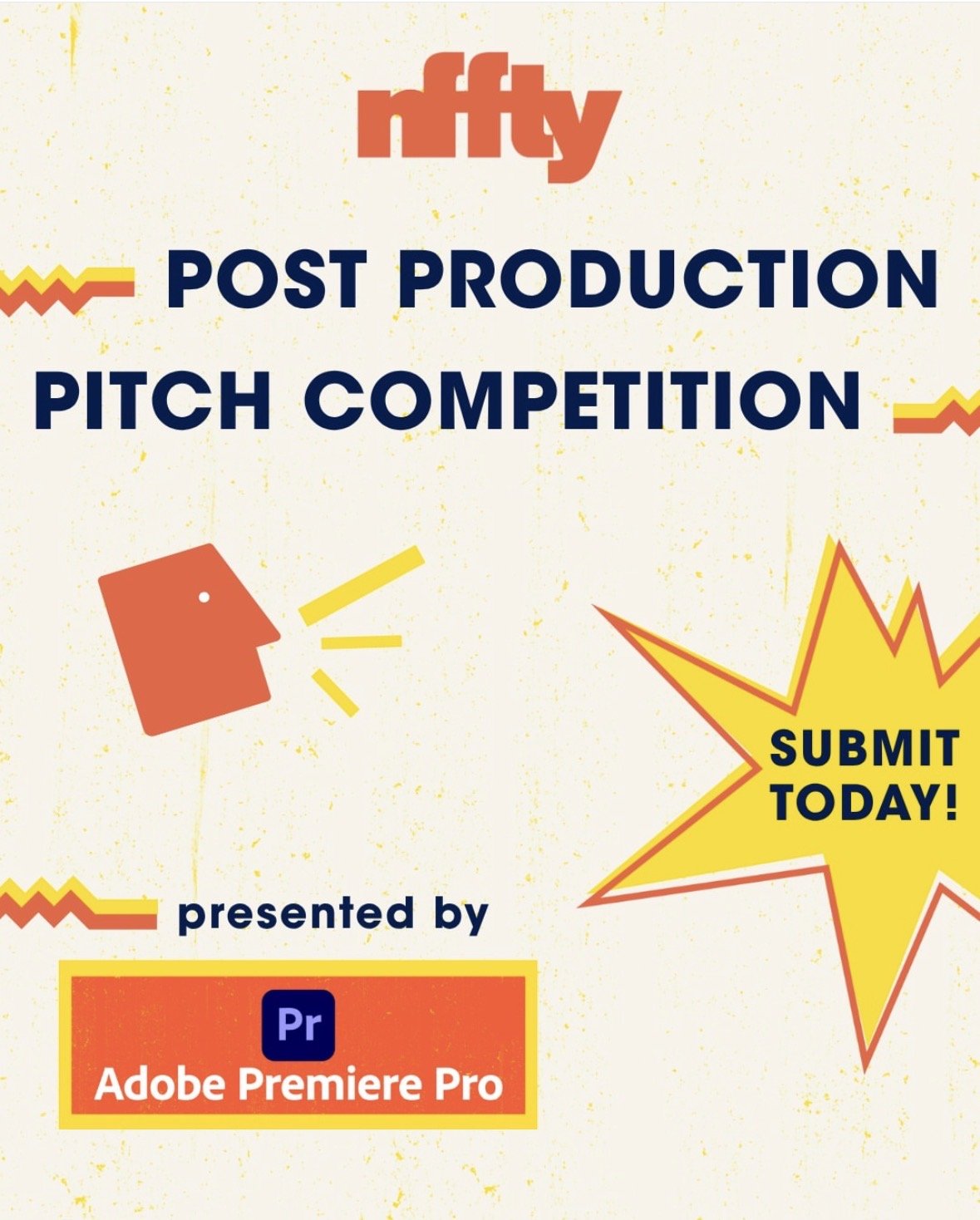
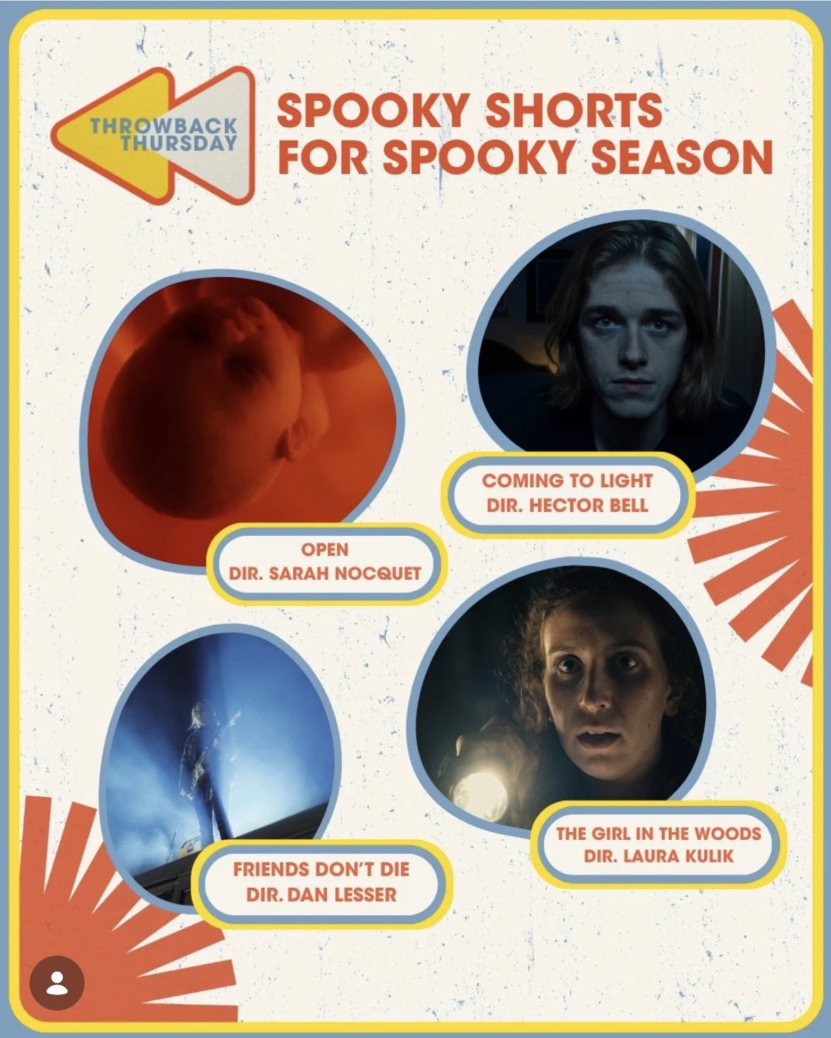
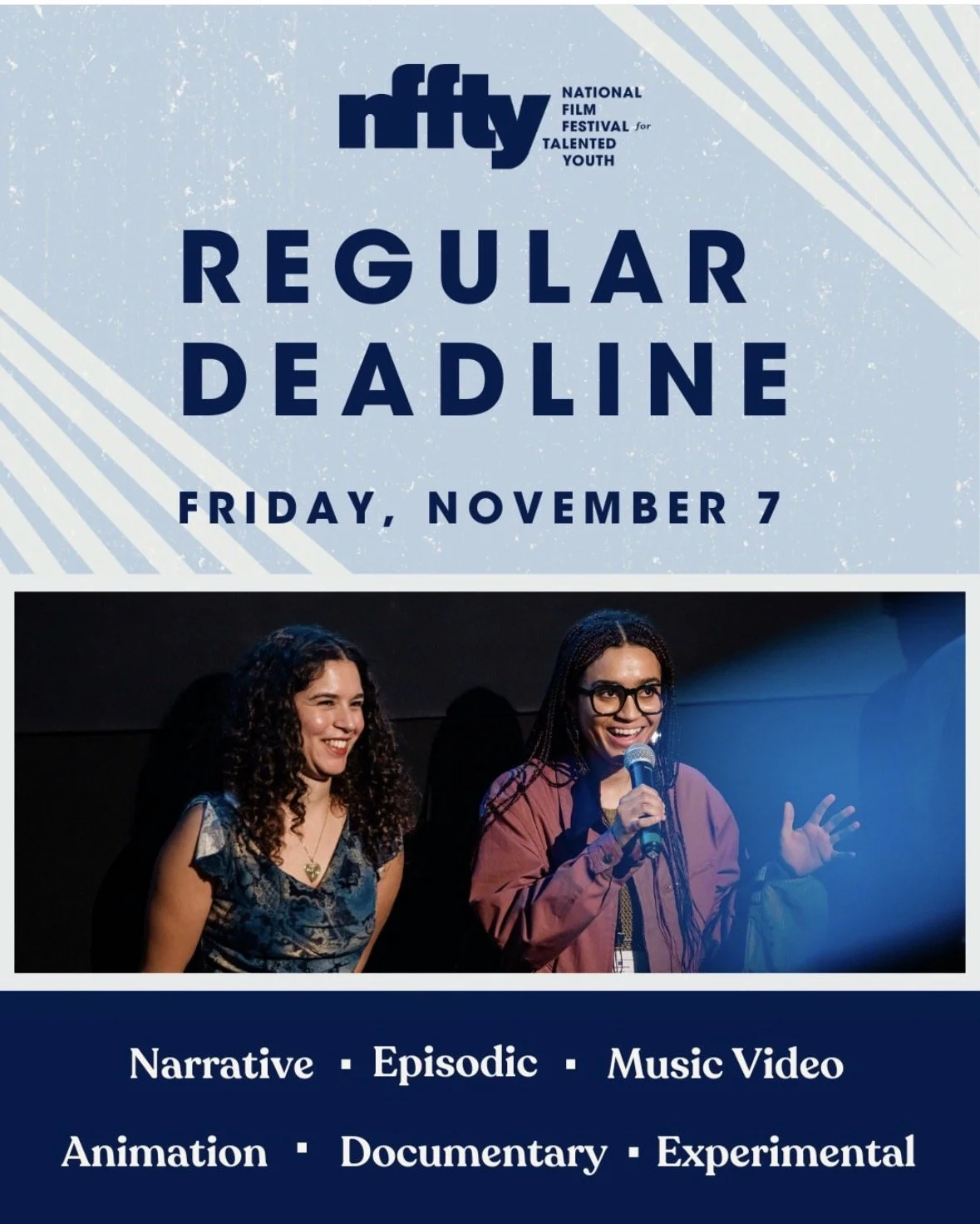
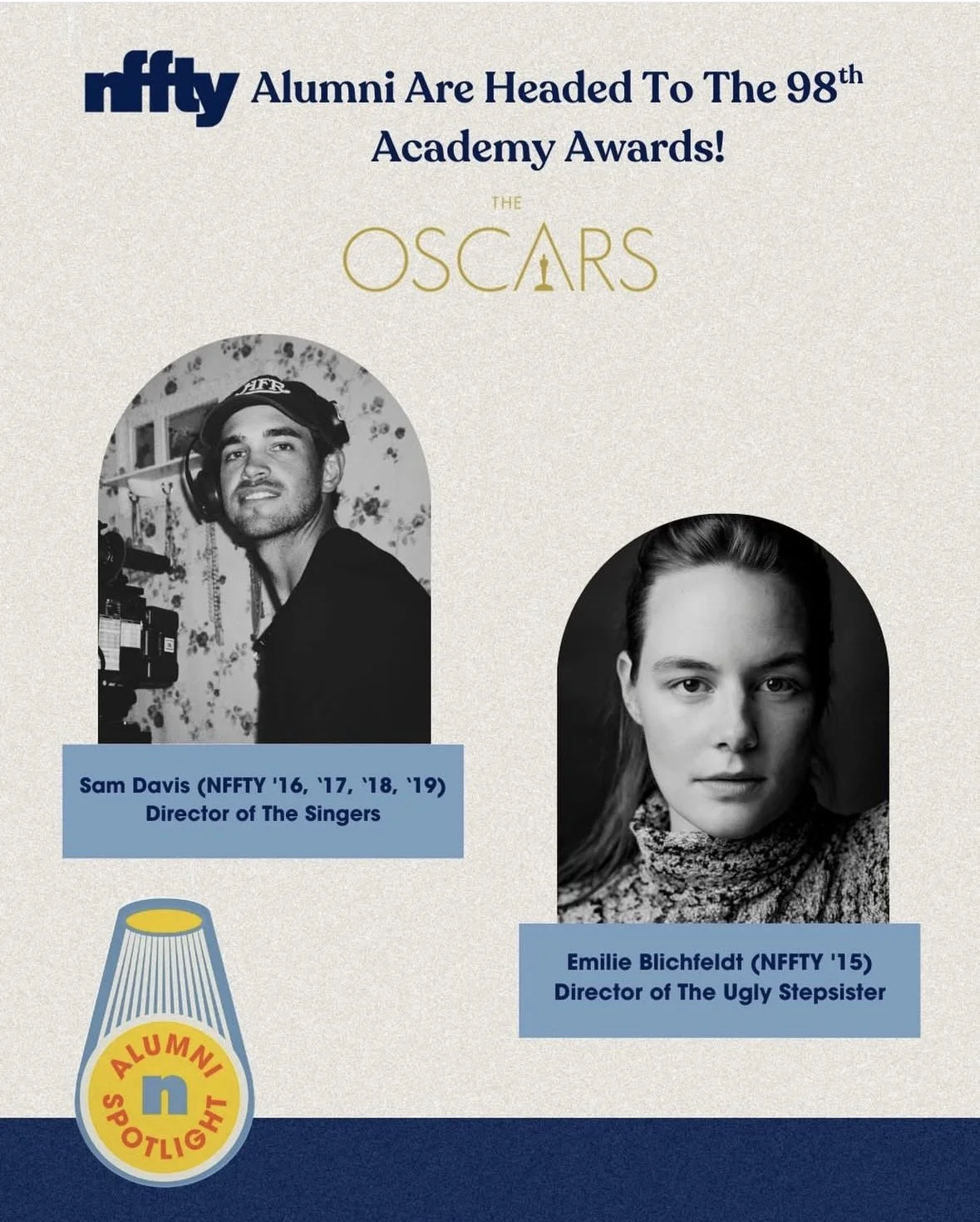
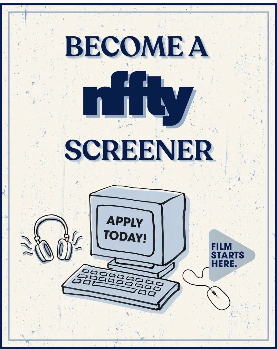
NFFTY’s brand identity was applied across a wide variety of digital assets including advertisements, social collateral and templates and web design.
When I took on this project, NFFTY only had two evergreen elements of brand: a primary logo and the primary brand color, navy blue. Below are just a handful of examples of how the NFFTY team has used the based elements provided in the the rebrand to expand their brand impact, as well as how festival designs have layers over the existing brand identity.
BRAND ASSET EXAMPLES